25.11.2024
The LANGUAGE/TEXT/IMAGE exhibition at the Draiflessen Collection
I once again found myself heading toward the Draiflessen Collection. Located in the small town of Mettingen, Germany, this museum has always fascinated me with its high-quality exhibitions. After writing about the FAITH exhibition and THE ART OF REPLICATION, I headed to the Draiflessen for the opening of LANGUAGE/TEXT/IMAGE.
The title sounded intriguing, and the fact it sounded generic made the anticipation even bigger. What would possibly be on show under those three cornerstone words? And, most importantly, how could these words transform the 900 square meters of the museum’s Main Space? With such reflections on my mind, I started on a Sunday morning to attend the opening of LANGUAGE/TEXT/IMAGE.
It was a sunny autumn morning, and the car rolled along the lush landscape. It always feels wonderful to return to places you enjoyed visiting. When the car stopped outside the Draiflessen Collection, I felt a sense of heartwarming familiarity when I saw the surroundings. Being greeted at the front door added even more to the museum’s welcoming feeling.
Shortly afterward, it was time to stroll around the exhibition and see how the curators had developed the theme of Language, Text, and Image.
Exhibition view LANGUAGE/TEXT/IMAGE
| © Draiflessen Collection, Foto/photo: Felix Krebs
LANGUAGE/TEXT/IMAGE at the Draiflessen Collection
I’m not an art critic; I’m an art-goer. I always clarify this because I want to share my experience in the art venues I visit. The goal of my art articles is to transmit my enthusiasm and encourage my blog readers to see as much art as possible. In brief, the goal is to share and inspire.
Talking about inspiration, the exhibition Language/Text/Image presents thirteen artists—or, to be more precise, 12+1. You will immediately see what I mean by that, but before that, I’d like to share the names of the participants.
Specifically, in Draiflessen’s Main Space, you will see the works (in alphabetical order) of John Baldessari, Maria Bartuszová, Alice Bidault, Alejandro Cesarco, Ayşe Erkmen, Nadine Fecht, Gary Hill, Janice Kerbel, Gabriel Kladek, National AIDS Memorial Quilt, Gordon Parks, Markus Vater, and Gillian Wearing.
Obviously, not every artwork can be included in this post. Moreover, I encourage you to discover them on your own, preferably at a steady pace. But here you can see what grabbed my attention and some accompanying info about them.
Exhibition view LANGUAGE/TEXT/IMAGE
| © Draiflessen Collection, Foto/photo: Felix Krebs
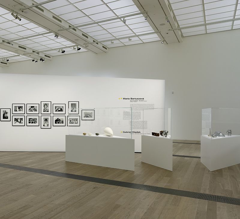
Maria Bartuszová’s sculptures and Gabriel Kladek’s photos
The first artwork you’ll see after climbing the stairs to the Main Space belongs to Maria Bartuszová and Gabriel Kladek. Kladek, an art historian and photographer, organized events (in 1976 and 1983) in an elementary school in Slovakia. The events were dedicated to blind and visually impaired children, and he wanted the children to touch Bartuszová’s sculptures. The artist used a variety of materials (plaster, bronze, aluminum), and the sculptures had round and sharp-edged shapes.
Although the children could barely (or not at all) see the sculptures, they could feel them. Kladek photographed those moments, and his work proves that art should be accessible to everyone.
Although the children could barely (or not at all) see the sculptures, they could feel them. Kladek photographed those moments, and his work proves that art should be accessible to everyone.
Maria Bartuszová, Gabriel Kladek
| © Draiflessen Collection, Foto/photo: Felix Krebs
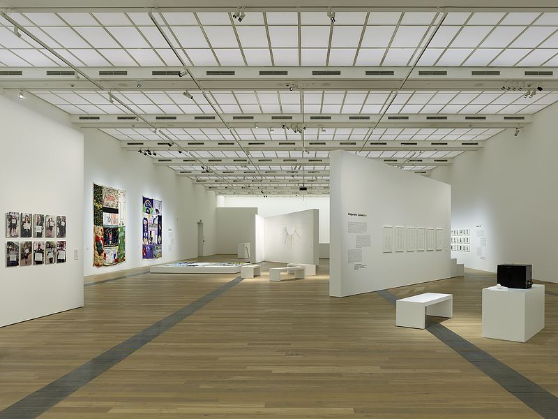
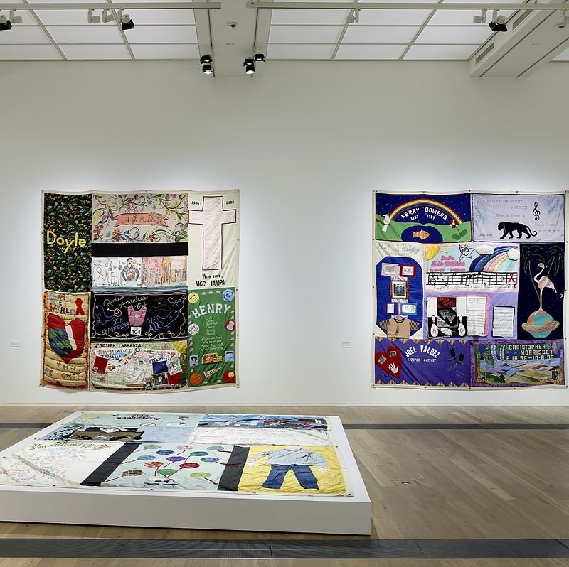
The heartbreaking National Aids Memorial Quilt
The AIDS epidemic has affected every country in the world since the 1980s. More than 35 million people have died of AIDS, and those blocks were among the most appreciated exhibits by the visitors at the opening.
Each of the three blocks exhibited consists of eight handmade panels created by individuals or communities. What makes the AIDS Memorial Quilt unique is that it uses different patterns and techniques. Various symbols, like hearts or letters, appear on these blocks, created to commemorate people who died of AIDS. The noble idea behind their creation was to give names, faces, stories, and sentiments to the people who died of the disease.
The National AIDS Memorial Quilt intends to give voice to people who were isolated due to AIDS and to encourage suffering individuals to talk publicly. AIDS is not a stigma, and this crisis requires information and solidarity. To this day, more than 50,000 panels have been created.
National AIDS Memorial Quilt
| © Draiflessen Collection, Foto/photo: Felix Krebs
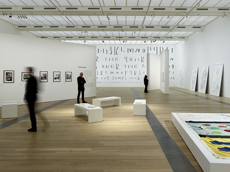
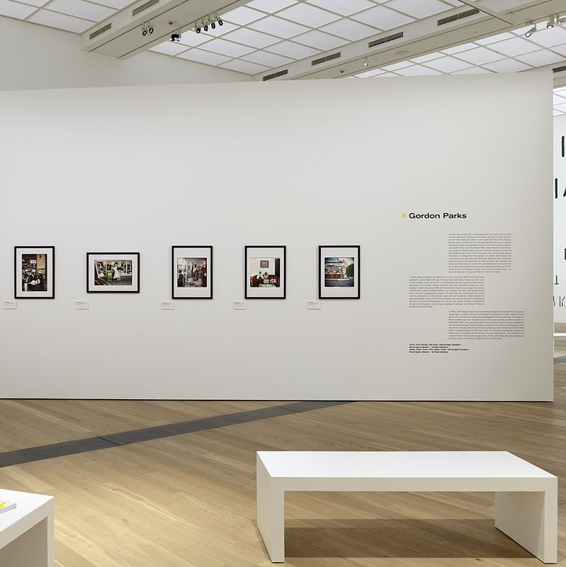
Five iconic photos by Gordon Parks
Equally heartbreaking is the short but enlightening presentation of five photos taken by Gordon Parks. Parks is one of my favorite photographers of all time due to his documentary style and his approach to exposing racism in the USA in the 1950s.
In 1956, Life magazine assigned Gordon Parks to show how life unfolded in the southern states of the USA. Racism was all over the place—and that was less than seventy years ago. The segregation was cruel: Black children weren’t allowed to go to the same schools as white children, but the borders were even stricter in daily life. Black people couldn’t buy ice cream next to the whites, weren’t allowed the same entrances to buildings, etc. Documenting the daily struggle of Black people is what we see in the photos.
The demand for equal rights (and it’s unbelievable that it’s not been achieved yet) is omnipresent in Parks’ photography. And the same goes for his hope and melancholy while he was photographing.
Gordon Parks
| © Draiflessen Collection, Foto/photo: Felix Krebs
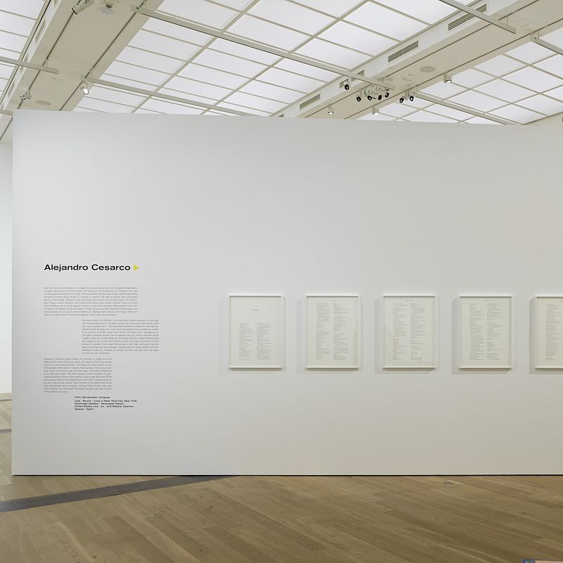
Impressed by Alejandro Cesarco’s “Index (an Orphan)”
Six digital prints stood on the walls of the Draiflessen Collection, and each looks like an index. Specifically, an index for a book. But there is no book, only that index, which is full of keywords, titles, and terms.
As a writer, I was very impressed by Cesarco’s work. Index (An Orphan) attempts to tell a story without a story. Perhaps you can see this as a storyline you must construct yourself. Although you will recognize some terms, others will remain self-referential. And that’s the beauty and the secrecy of Cesarco’s artwork. There’s probably no beginning, end, or even a story. Yet, this charming artwork is about a story that’s either hidden or never written.
As a writer, I was very impressed by Cesarco’s work. Index (An Orphan) attempts to tell a story without a story. Perhaps you can see this as a storyline you must construct yourself. Although you will recognize some terms, others will remain self-referential. And that’s the beauty and the secrecy of Cesarco’s artwork. There’s probably no beginning, end, or even a story. Yet, this charming artwork is about a story that’s either hidden or never written.
Alejandro Cesarco
| © Draiflessen Collection, Foto/photo: Felix Krebs
Gary Hill’s secluded Universe is full of questions
Gary Hill has been exploring what language is for more than half a century. In his videos, he always attempts to find connections between sounds, words, and images. Language/Text/Image presents three videos exploring this subject. The formation of words and sounds creates visual landscapes and times when the viewer might feel overwhelmed. However, the ancient questions of humans are always there: how do we perceive language? How do we form it? And, after all, what really is language?
Gary Hill
| © Draiflessen Collection, Foto/photo: Felix Krebs
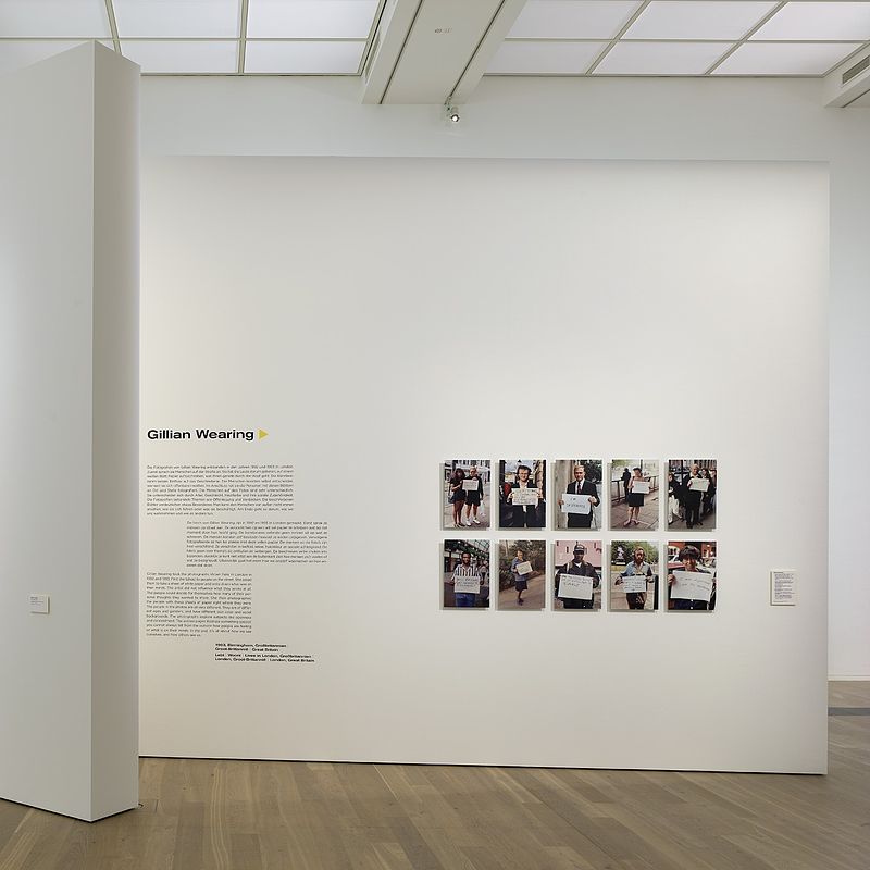
Gillian Wearing photo-statements
One of the most interesting exhibits at the Draiflessen was the set of photos by Gillian Wearing. Between 1992 and 1993, Wearing walked the streets of London and started talking to people. She then handed them a white paper and asked them to write down whatever was in their minds. There was no guidance or manipulation; it could be anything.
The results were beyond existing. She photographed each person holding the written paper and created a series of fantastic images. One thing that deserves to be noted is that people come from different social backgrounds, ages, skin color, and genders. Wearing’s series deals with feelings and self-perception and how often we hide everything, even from ourselves.
The results were beyond existing. She photographed each person holding the written paper and created a series of fantastic images. One thing that deserves to be noted is that people come from different social backgrounds, ages, skin color, and genders. Wearing’s series deals with feelings and self-perception and how often we hide everything, even from ourselves.
Gillian Wearing
| © Draiflessen Collection, Foto/photo: Felix Krebs
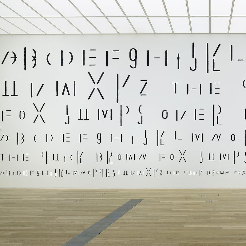
The impressive mural by Ayşe Erkmen
The wall on the Main Space’s end features an impressive mural created by Ayşe Erkmen. At first glance, the Typed Types looks more like a code and less like a piece of art. You need to check it again and again to understand its meaning.
What appears to be a code is actually letters in different typography fonts. And those letters construct a well-known dummy text: “The quick brown fox jumps over the lazy dog.” The sentence has no hidden meaning -actually, the meaning goes beyond it. It’s more about the typography and less about the meaning of the sentence. The sentence has to contain every letter of the alphabet because people want to see how a text will look when a specific font is used. Erkmen’s artwork deals with how we comprehend language and how our point of view is affected by typography.
What appears to be a code is actually letters in different typography fonts. And those letters construct a well-known dummy text: “The quick brown fox jumps over the lazy dog.” The sentence has no hidden meaning -actually, the meaning goes beyond it. It’s more about the typography and less about the meaning of the sentence. The sentence has to contain every letter of the alphabet because people want to see how a text will look when a specific font is used. Erkmen’s artwork deals with how we comprehend language and how our point of view is affected by typography.
Ayşe Erkmen
| © Draiflessen Collection, Foto/photo: Felix Krebs
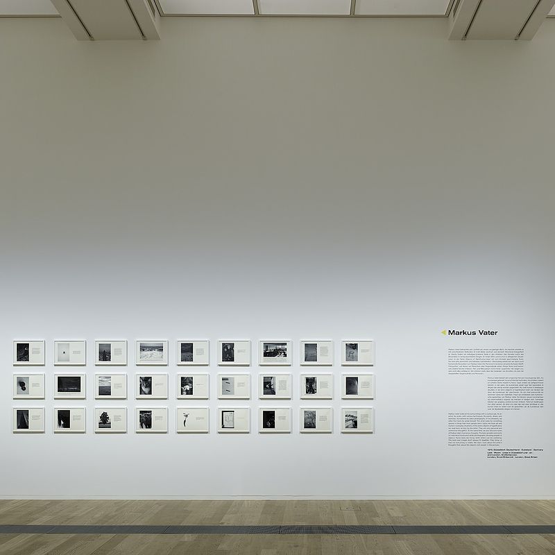
Objects of Significance, by Marcus Vater
Apart from Cesarco, as a writer, I was also intrigued by Markus Vater’s work. The series Objects of Significance was probably the most playful Language/Text/Image exhibit. Vater often pairs photography with the written word: He shoots photos and then adds text to them. His attention is caught by ordinary things and moments most people overlook.
The texts aren’t always connected to the subject he photographs. Nonetheless, his take is always playful and witty. Sometimes, the text might not totally reflect the image, yet the result is charming. Seeing it as a solid work of art, you gain a deeper understanding of Vater’s whereabouts and thoughts. The artist doesn’t seem to deal with the visible: what interests him is also what remains off-sight and everything that belongs to the inner world.
The texts aren’t always connected to the subject he photographs. Nonetheless, his take is always playful and witty. Sometimes, the text might not totally reflect the image, yet the result is charming. Seeing it as a solid work of art, you gain a deeper understanding of Vater’s whereabouts and thoughts. The artist doesn’t seem to deal with the visible: what interests him is also what remains off-sight and everything that belongs to the inner world.
Markus Vater
| © Draiflessen Collection, Foto/photo: Felix Krebs
Final thoughts
Language, images, and texts surround us daily. They define us, they create certainties or questions, and at the same time help us communicate. Or keep us apart from others and imprison us in our microenvironment. Messages are being transmitted, statements are declared, and they help us solve problems or create new ones.
The role of the audience is crucial for a forward-moving society. These three cornerstone elements largely shape us. These elements raise even more questions about the limitations of secluded communities and about what we decide to hear and see. The exhibition Language/Text/Image dares to challenge our perception and understanding of the world surrounding us.
The thirteen artists (or, again, 12+1, or even 12+plenty) transcribe how we understand language, texts, and images uniquely. Once again, visiting the Draiflessen Collection created a fascinating experience that exceeded my expectations. It wasn’t just my writer side that got triggered; it was also my side as an individual and member of an ever-fluid society that made me question myself and my use of language, text, and images. And for that, I’m grateful beyond words.
George Pavlopoulos, author of this article, has published three novels: 300 degrees Kelvin in the Afternoon (2007), Steam (2011) and The Border and the Wave (2014). Most recently, he published the volume of short stories Von Zuhause so fern (2020). In his travel blog Letters to Barbara, he presents texts on and photos of the places and regions he travels to.
This article was first published on Letters to Barbara (https://letterstobarbara.com/)